less stop waiting.
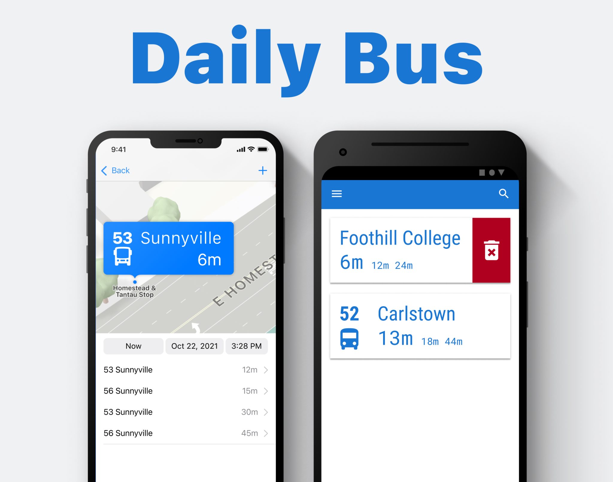
~8 days à 8 hours; Role UX/UI Designer; Figma;
UX:
- Competitor Analysis (3)
- User Interviews (2)
- Task Analysis & User Flows (3)
- User Tests (6)
UI:
- Drafts
- Paper Prototypes
- Low / Mid / High Fidelity
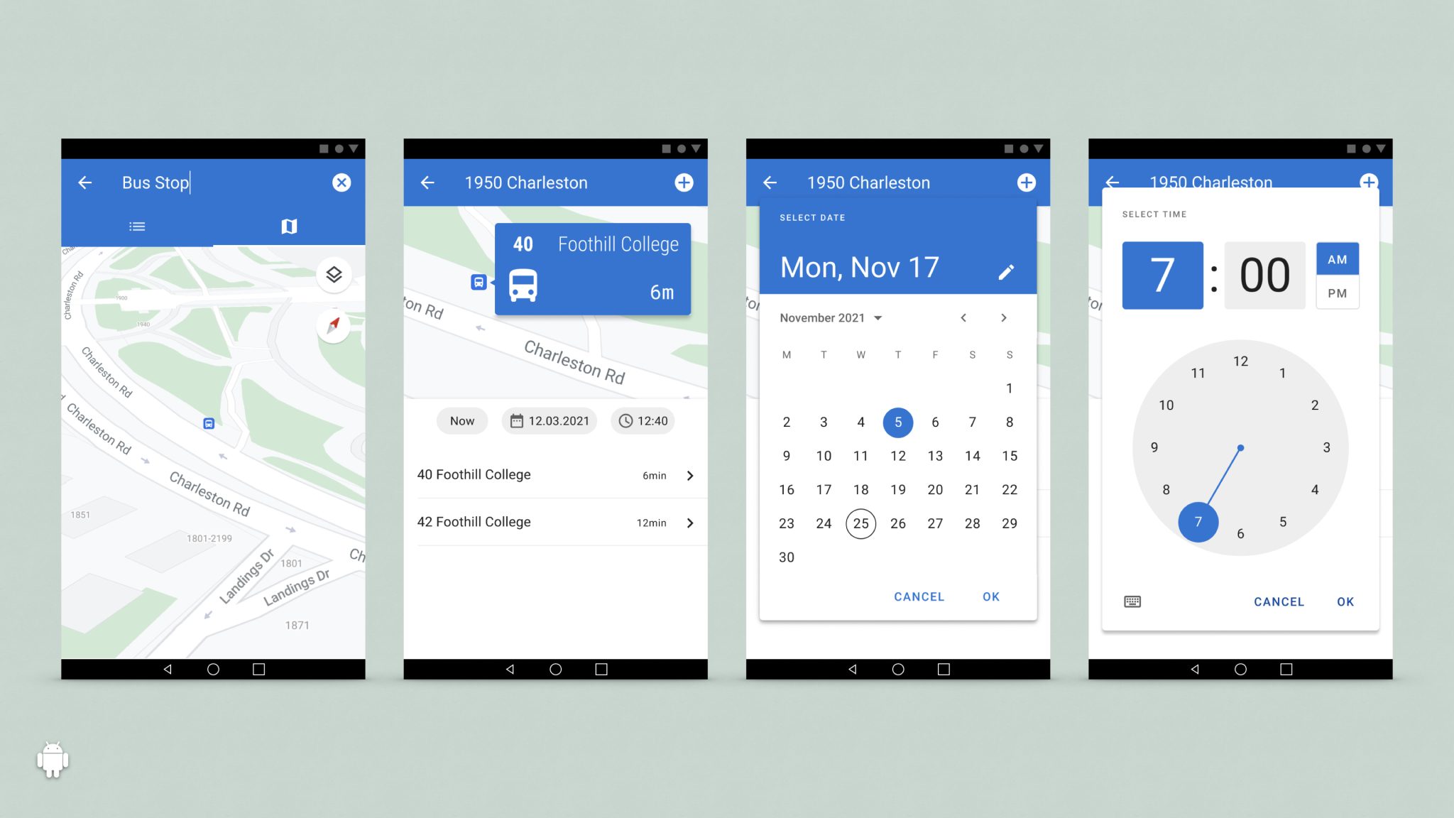
Restrictions: The App needs to look as native as possible on each platform.
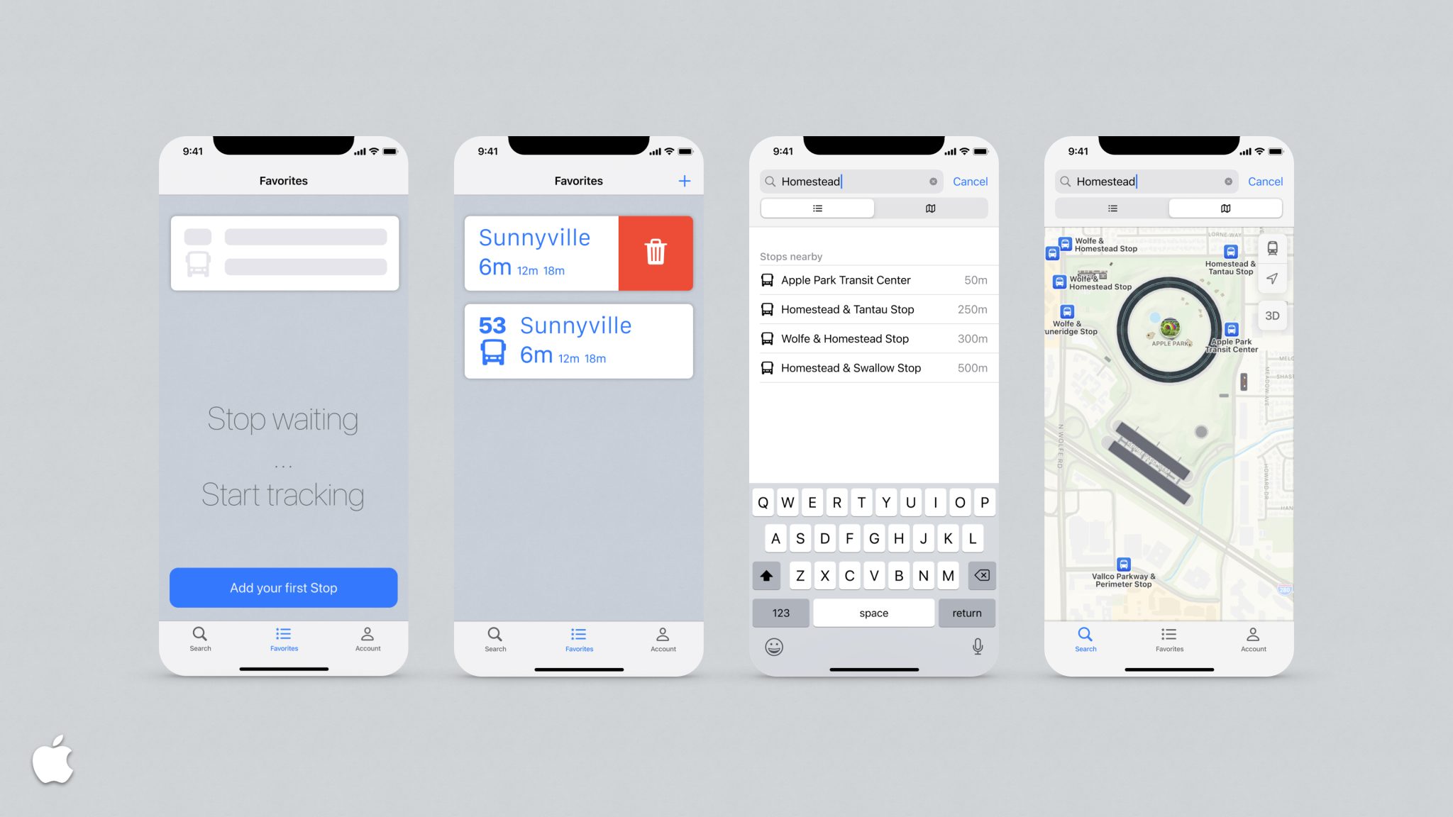
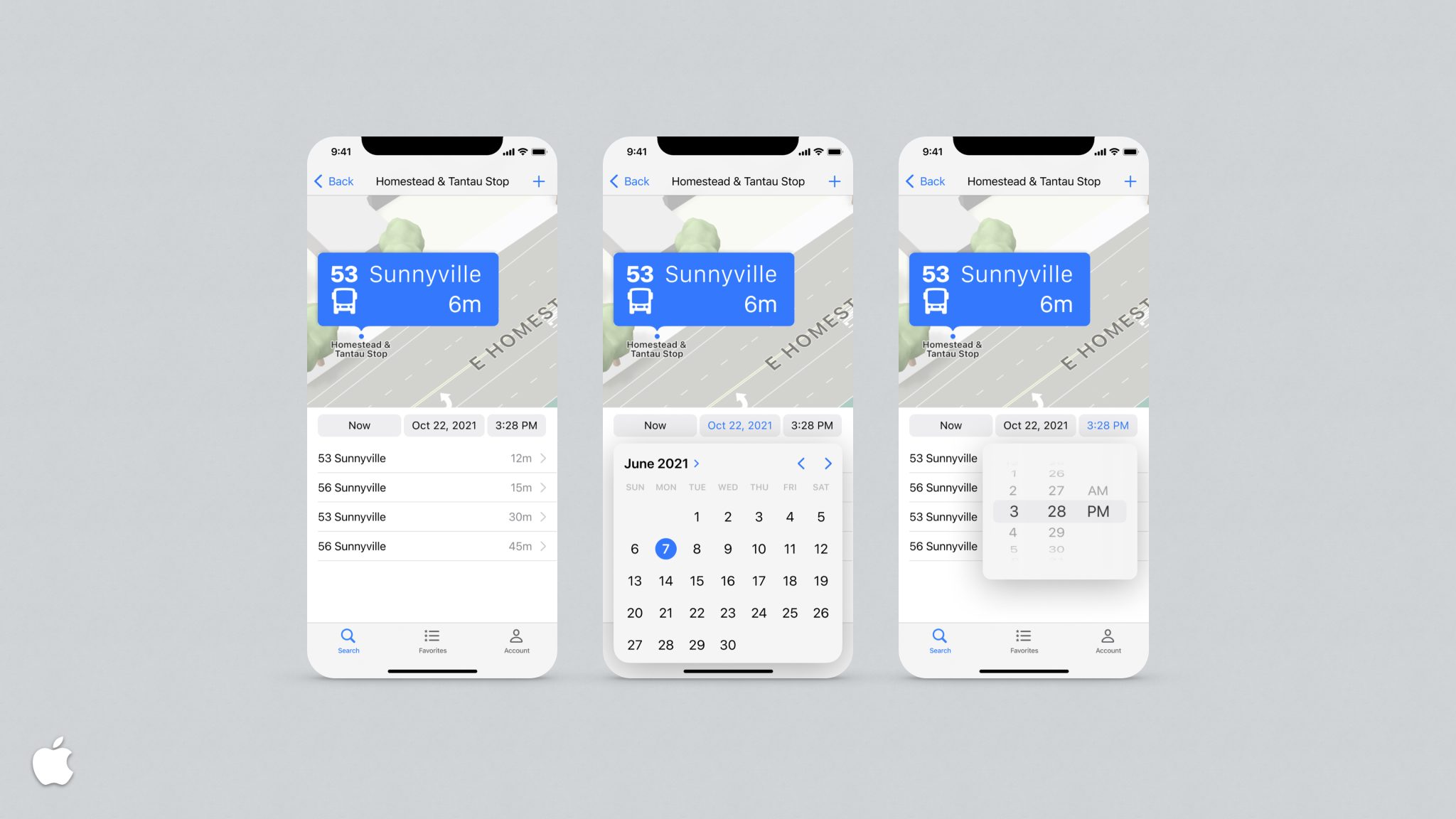
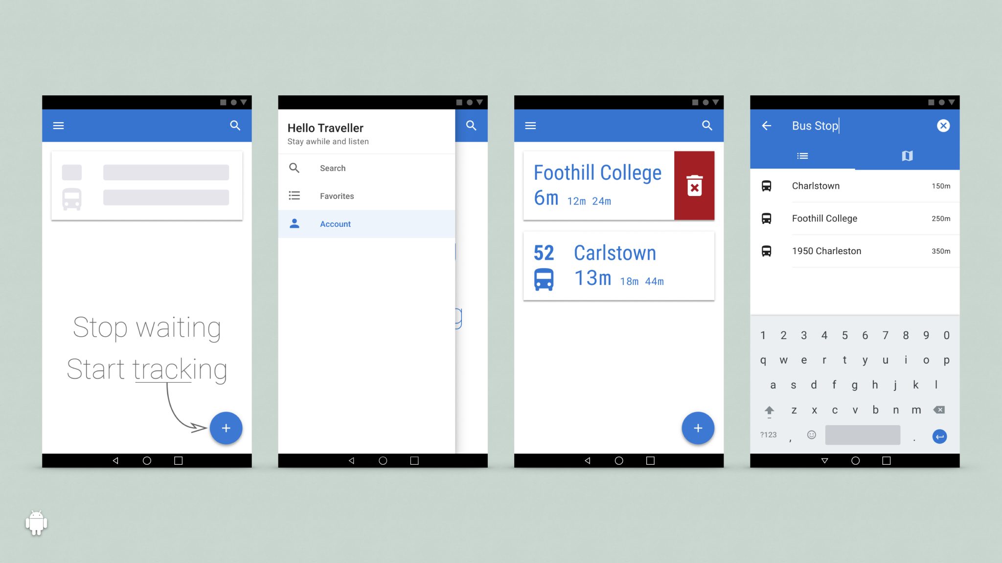
Details
UX:
App Name: Daily Bus
Objective: Show arrival and departing times for daily used bus stops
Context: There are (too) many apps that give you
- a list of all stops
- you need to search and adjust time to see the stops
- all-together cluttered with settings
Users: Students, Daily Commuter
Key Features:
- Search, select and add a bus stop
- Check upcoming busses/trams
- Advanced lookup for future times
UI:
The challenging part was to make it look native. Since the introduction of Flat and Material Design, the looks pretty much blend together. The most important distinctions are in the interactions.
- The Side Drawer is native to Android
- Swiping from left opens the Drawer on Android, but navigates back in iOS
- Lack of physical or virtual buttons on iOS needs different approaches to UI