The Challenge
Create a slick UI for a real-time asset management, energy generation and consumption web application. Extend the current brand identity beyond business cards.
My Role: Senior Developer & UX/UI Designer
Company Size: ~10
Company maturity: Start-Up
My Tasks were to create or enhance following areas:
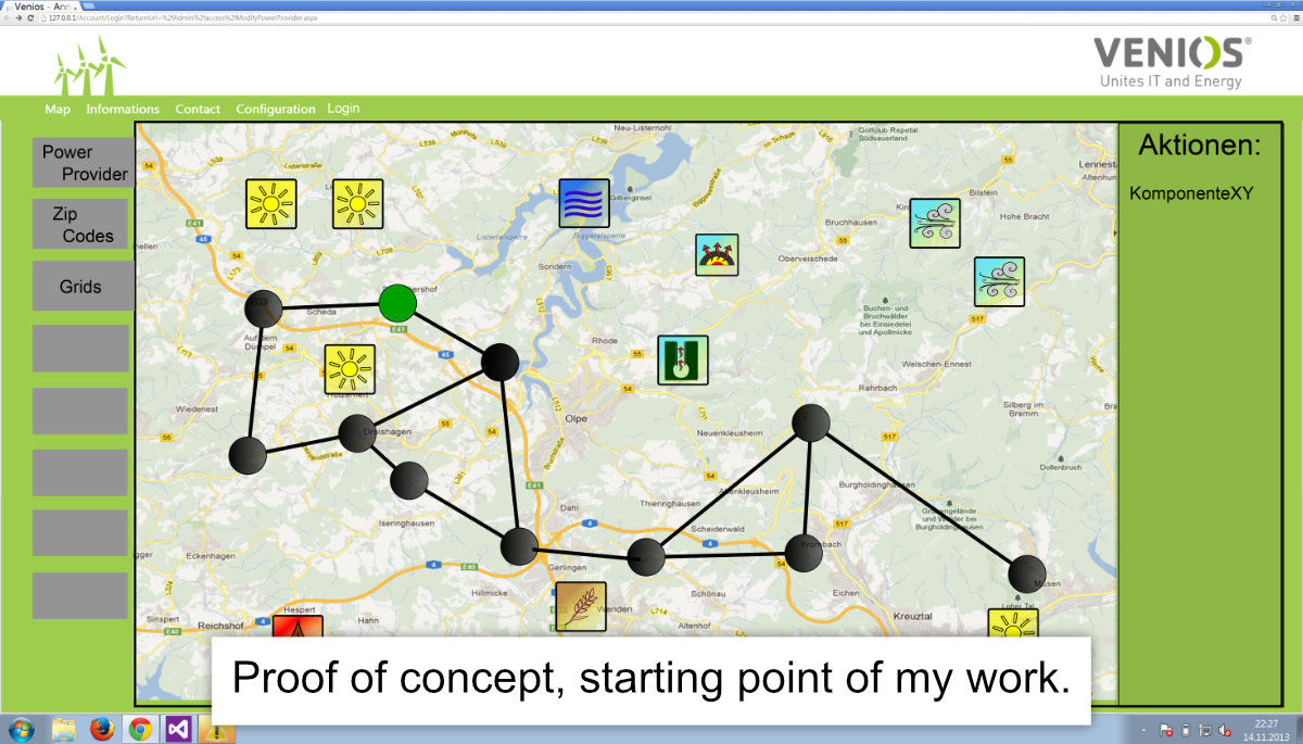
When I joined the company, the design wasn’t structured and I had to build up most of it from scratch.
(Big shout-out to Maximilian Wurm you did your best and thank you for allowing me to showcase it as a starting point in my portfolio)
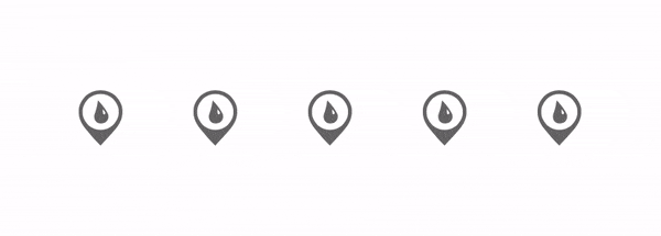
How to visualise the invisible? Heat, gas, wind and solar power?
Icons
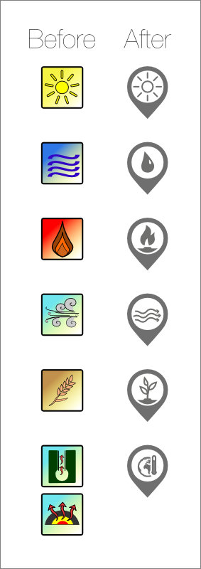
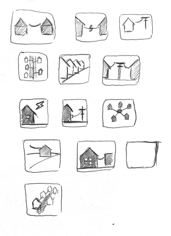
My first task was to redesign icons for energy generator and consumer for the overview on a map. This is where I started from.
Make it simpler, drop the colour. Colour should only communicate status and used sparingly on a map-based interface.
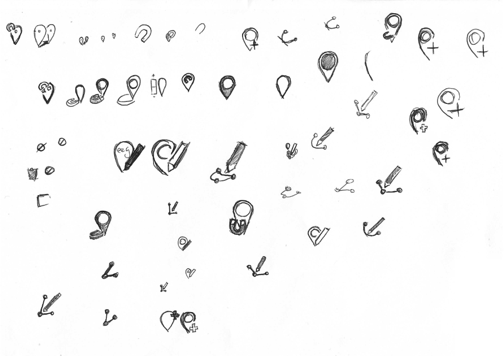
After a thorough research of competitions iconography it was time to hit the drawing board or block in that case.
These are the drafts that survived
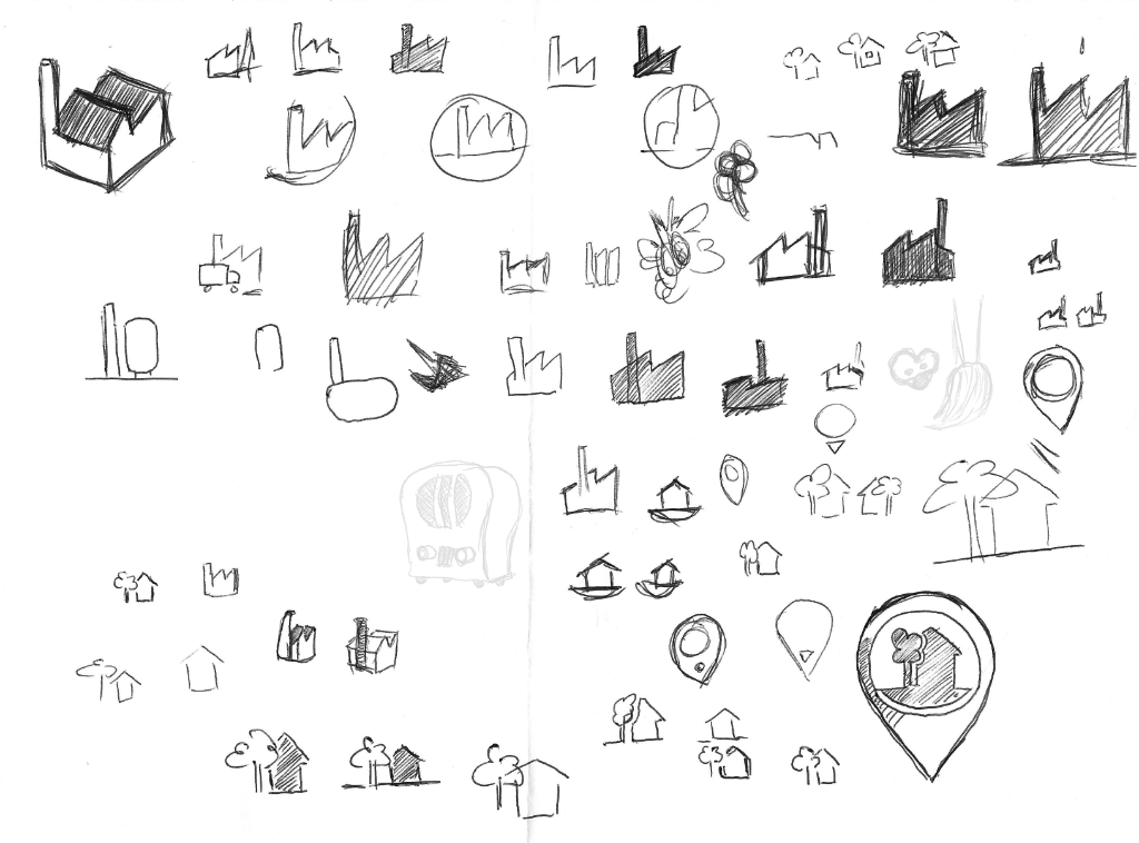
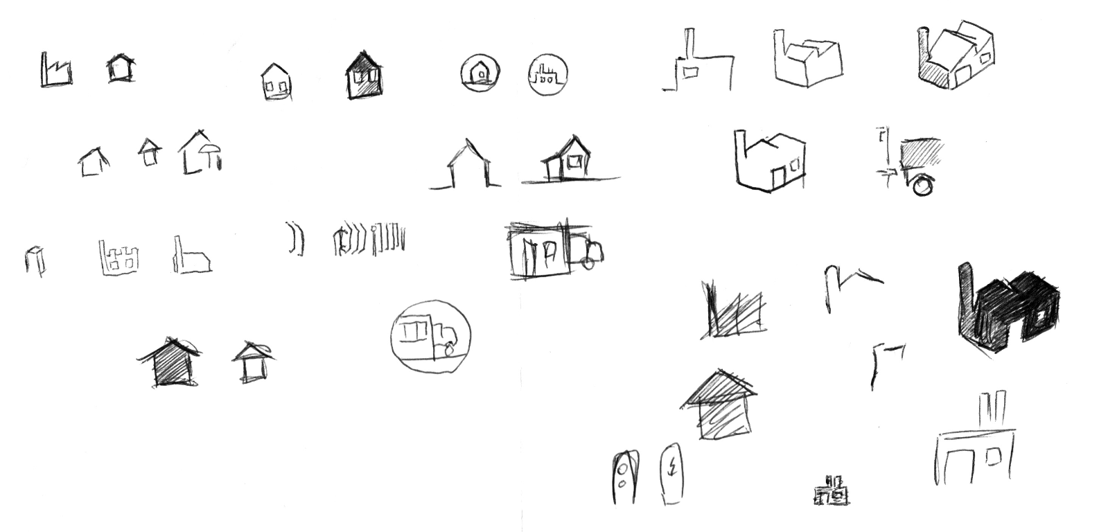
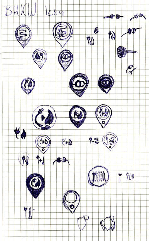
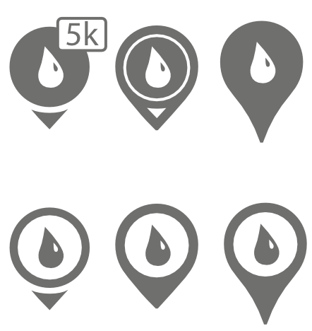
Drawing vector graphics make the pins looking sharp but contrary to regular images, it takes a heavy toll on the CPU for rendering every instance.
Visibility and distinguishability have to be guaranteed on different map settings.
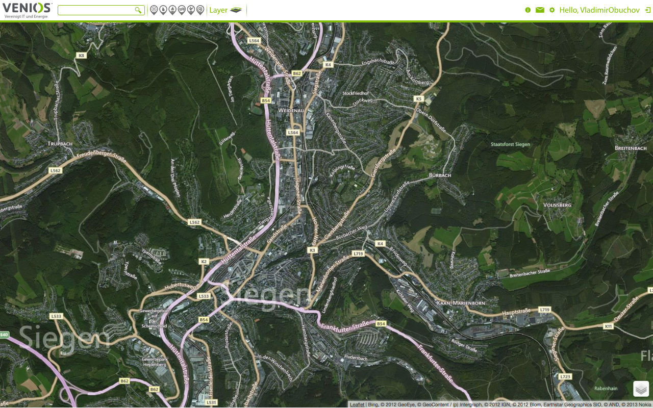
Webdesign
The next step was designing a website. Starting out with a logo, corporate design colour and a bought template for a handout.
The requirements for the website were:
- Blog about recent and upcoming events
- Advertise services and products
- Robust and elegant design reflecting company philosophy
- Mobile
- Multilingual / WordPress
- SEO Optimisation
The only piece for orientation
It was wild back then!
Colour, bars and the logo were carried along to design a matching website to the handouts and business cards.
Animations (After Effects)


The goal was to show at a glance that this company is about e-mobility and the energy management sector.
Three animated eye-catchers for the website, simple and not intrusive communication of the tech expertise.
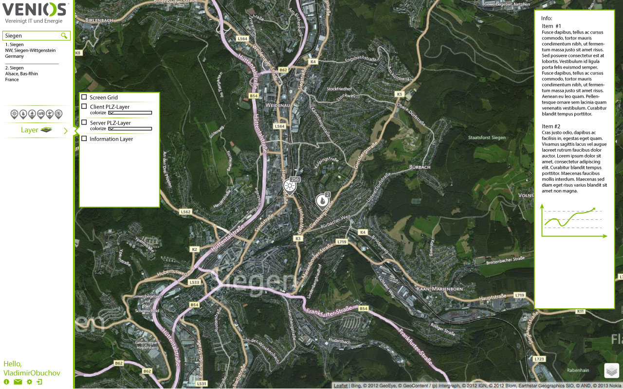
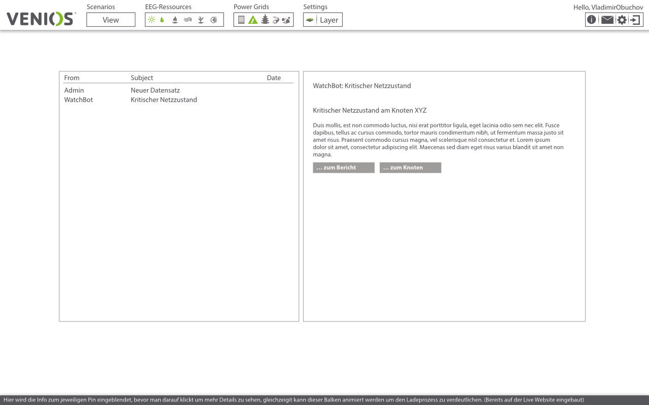
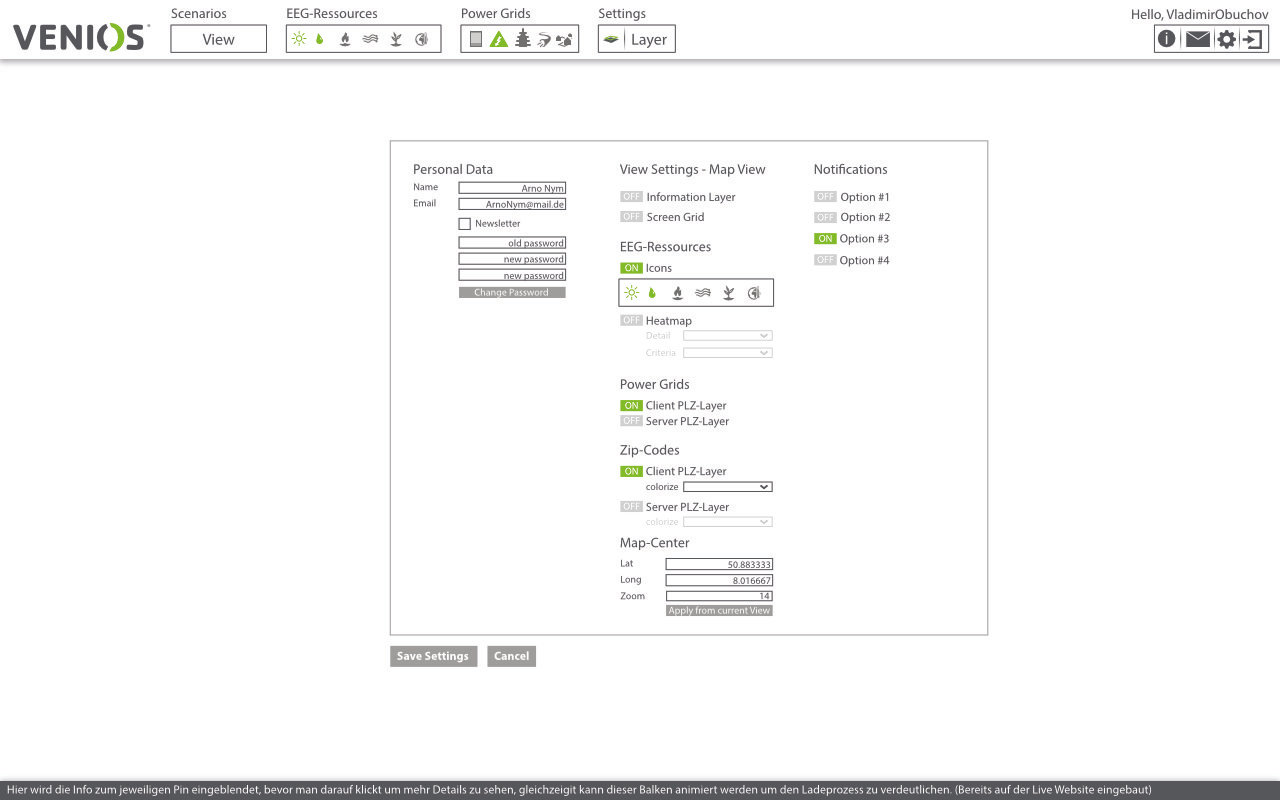
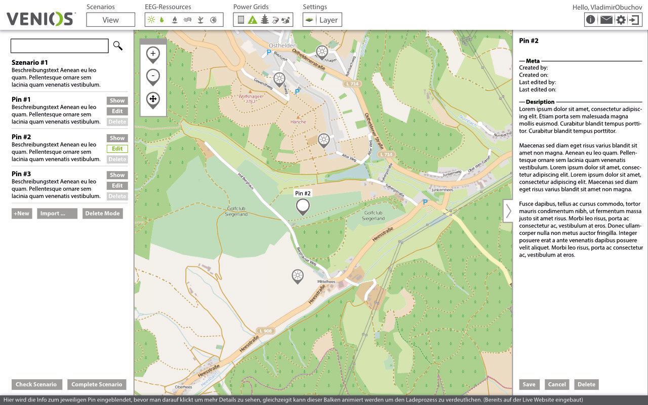
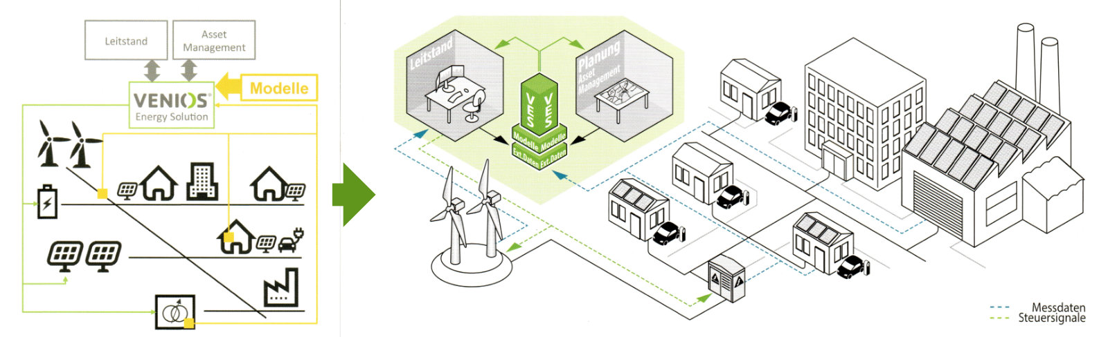
User Interface
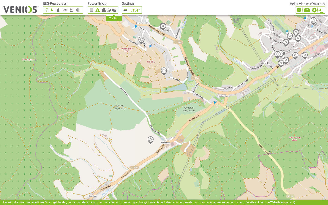
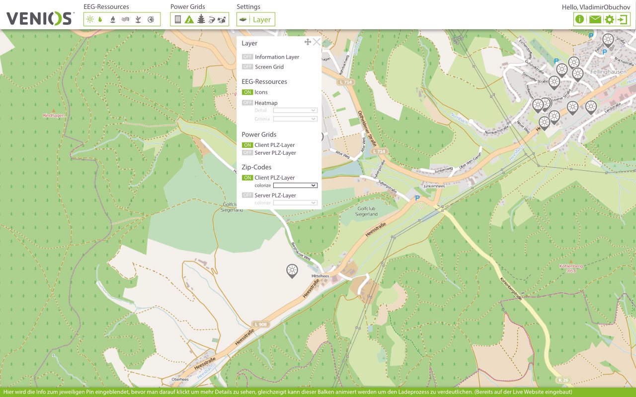
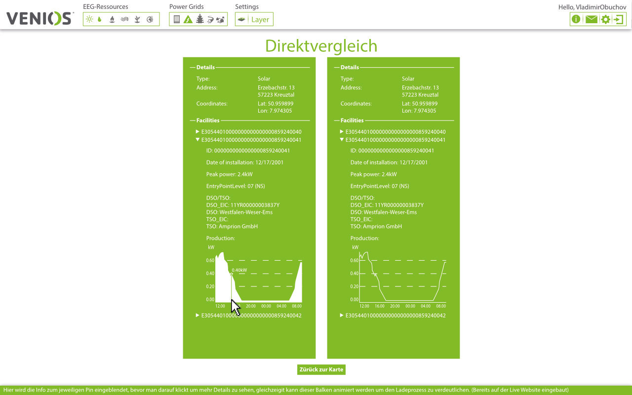
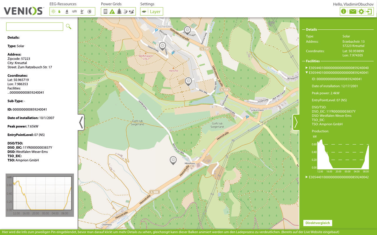
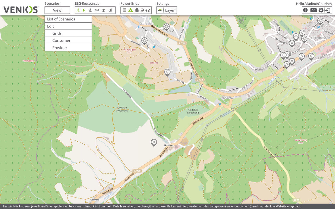
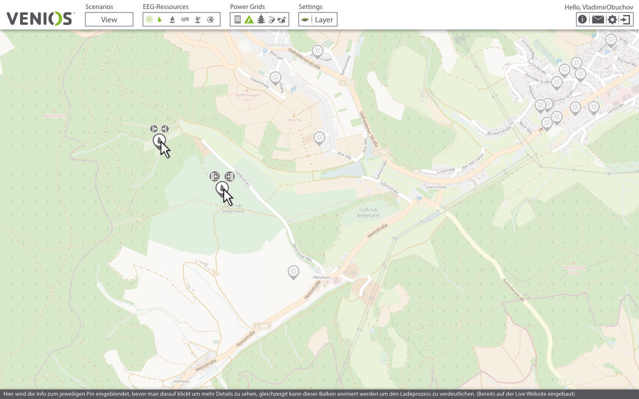
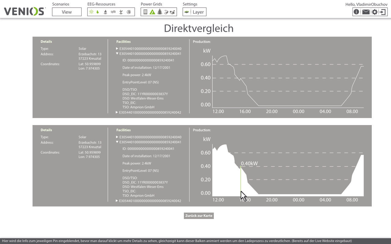
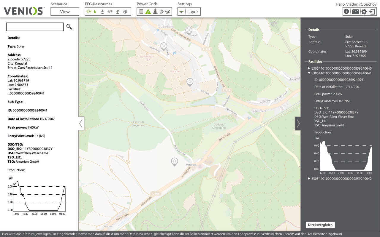
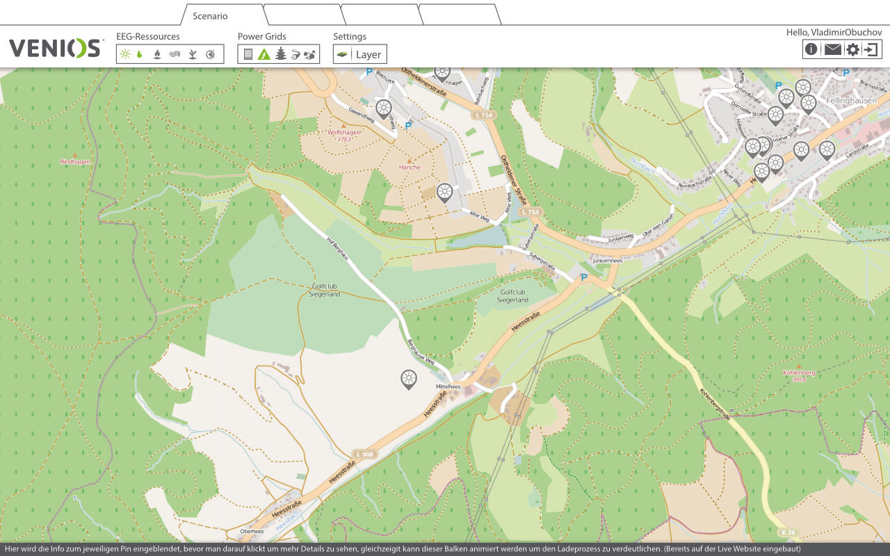
The next big challenge I had to face was to design a usable interface for a complex map based application, without having the in depth expertise of the energy sector quirks.
- Colour palette usage should be minimal
- Kendo UI was used as a RAD-Tool, thus a general look and feel was already set in stone and not negotiable (everyone loves rapid application development tools, a pure nightmare for a designer)
- A web-based application that should be scalable
Progression
Show possibilities, get a direction

Narrow down colour usage. Reason with stakeholders.
Show examples of why green doesn’t work.
Further Exploration
Things I learned building this UI with Kendo
- Rapid Application Development libraries are a pain to work with, developers love them, start to use them and then don’t give them away anymore.
- These Frameworks look good but do not work. Most of the time they are on their death bed and only a matter of time until called obsolete by technical progress of browser technology
- When you use these Frameworks as their developer dictates, you might be fast, beware of stepping outside the line, simple changes blow up instantly
Interaction Design
Flower Menu: Reduce mouse travel time for the most used interactions
- Interactions inside a web browser are limited, right-click and context menu are used by the browser itself
- Dragging must be handled with care on a drag-able background
- Dynamic menu with different options count behind every pin
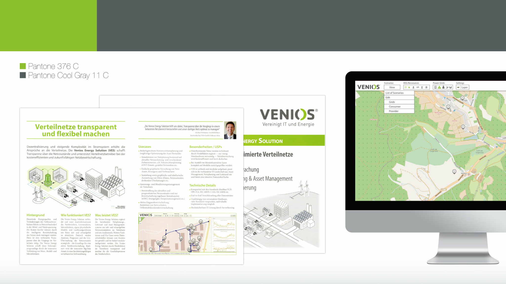
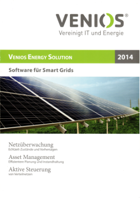
Print Design
Here are the scans of physical products
After creating the UI it was time to level up the print handout, after all exhibitions are the main place to hunt for clients in this sector.
When I joined it was lets say: Sub-Optimal

- Dangerous looking Image on the front
- Too small font on the back
- Too little contrast
- Shadow drop for the UI Mock-up
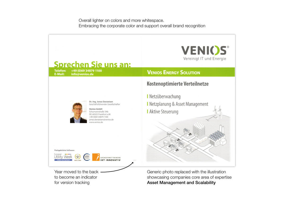
The first iteration was about fixing these problems and adjust the handout to Corporate Design.

- Still too much text
- Illustration on the right is hardly understandable
- Year on the cover is too dominant
“Nothing is older than yesterday’s newspaper”
Visualisation (Illustrator)
First of all the cover image has to reflect better what the core business is, after all we were not selling either solar panels nor energy, but a service to monitor it. As a bonus it had to show that our solution is scalable.

Second, I had to dig into the meaning and symbols used in the original image. The solar panels looked like waffles. The lines didn’t come over as streets or local connections between places.
- Exchanged yellow for blue
- More structured layout
- VES visualisation with a more representative iconography
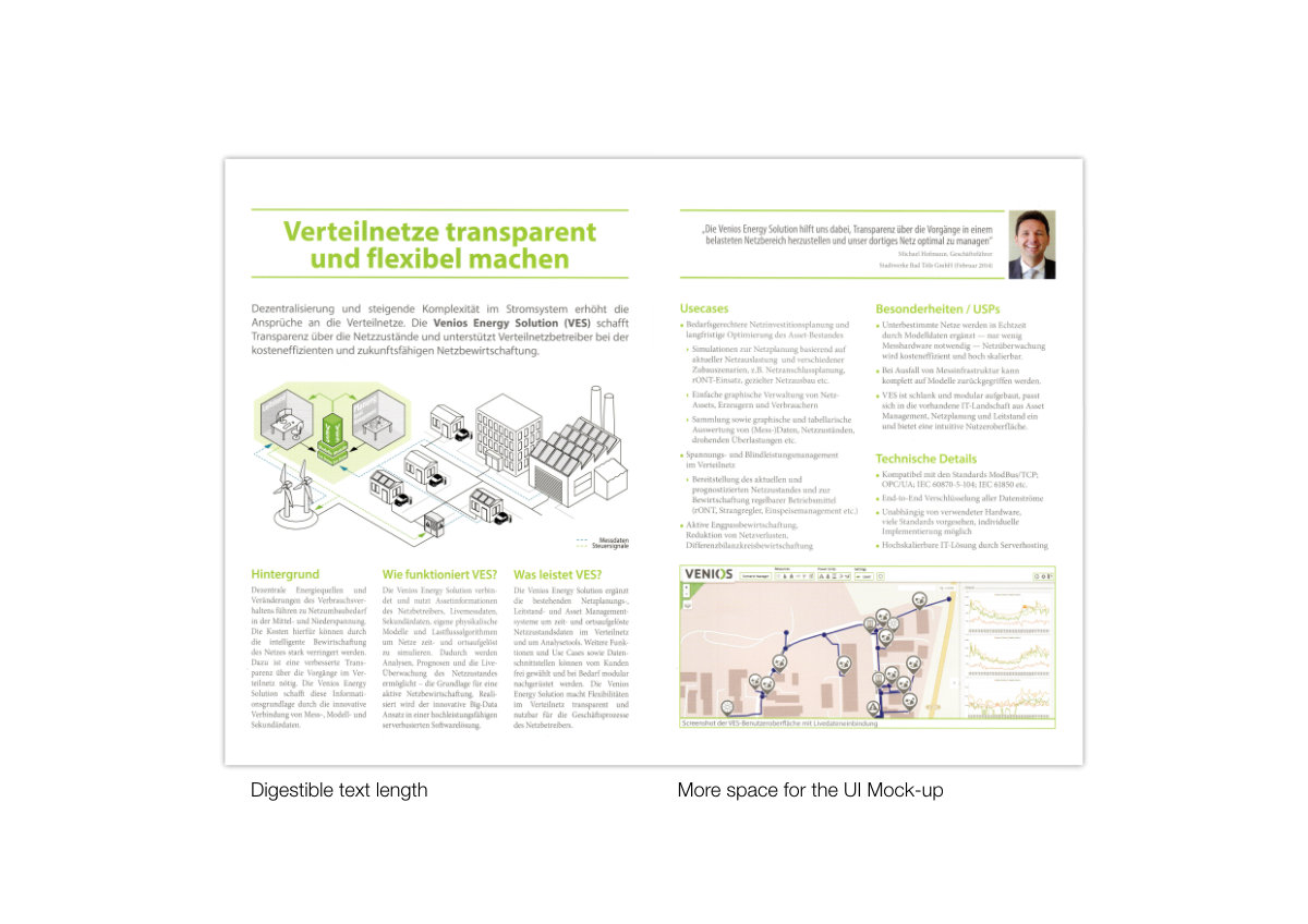
Final Handout
Bonus: Roll up display
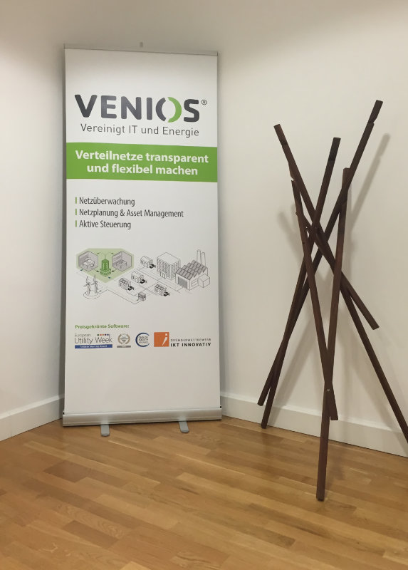
- Reading comfort
- Clean Design
- Logo at eye-height
- Small print readable while standing
- Gradual exposure to information through font-size and distance
- Logo
- Slogan
- Area of expertise
- Illustration
- Awards
Summary
It was the project with the most impact by my design to this day.
If you check out their product page on the azure marketplace, you will see that my design is still holding up and used to carry on the products look and feel.
These designs were made in 2013-2015. A lot has evolved in technology and design principles since then, regarding to web standards and best practices.